Project Overview
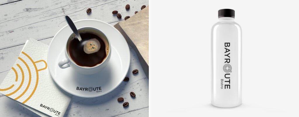
The thought process behind this logo design was to create a unique and memorable symbol that would effectively communicate the essence of the restaurant and what it offers to its customers. The shape of a pan in the form of a maze symbolizes the journey of taste that the restaurant offers to its customers. The intricate maze-like design of the pan also highlights the complexity and depth of flavors that can be experienced at the restaurant. The golden color represents luxury and richness. The logo creates a sense of excitement and adventure, encouraging customers to explore and discover new flavors as they navigate through the maze of taste.